1. Introduction (PDF & R-Code)
The independent variable – other terms include the treatment (0,1), predictor, or exogenous variable – is the mechanism in the population that we hypothesize causes changes in the dependent variable. That is, we believe that when a cases’ score on the independent variable increases or decreases, a cases’ score on the dependent variable will vary to some degree. In line with this postulation, it is extremely important for us to operationalize the independent variable on the scale that exists in the population. If we do not, we run the risk of reducing the magnitude of the association between the independent variable and dependent variable, potentially leading to interpretations and conclusions not representative of the association in the population. Let’s get right into our simulations, as a lot of the discussions important to altering the level of measurement for a construct were included in Entry 13.
Brief Recommendation: I suggest reading Entry 13 – The 30-page summary, I know – as it is important to the discussions and analyses presented in this entry.
2. Continuous Operationalization of X
To establish a baseline, we can begin by simulating our independent variable (X) by drawing scores for 10000 cases from a continuous normal distribution with a mean of 0 and a standard deviation of 10. Afterwards, we can specify scores on the dependent variable (Y) to be equal to – or causally influenced by – the scores on the independent variable (X) plus a random draw from a normal distribution with a mean of 0 and a standard deviation of 1. Through this specification process, a 1 point increase in X will be associated with a 1 point increase in Y.
n<-10000

set.seed(1992)

X<-1*rnorm(n,0,10)
Y<-1*X+1*rnorm(n,0,30)

DF<-data.frame(X,Y)
Following the protocol described in Entry 13, we estimate 1) a spearman correlation, 2) a bivariate linear regression model, and 3) a linear hypothesis test to observe the test statistics for the association. The spearman correlation between X and Y was .31, the t-score was 35.143, and the X2-square score was 1235.034. The hypothesis tests provide evidence that the slope coefficient of the association between X and Y was statistically different from zero.
> corr.test(DF$X,DF$Y, method = "spearman")
Call:corr.test(x = DF$X, y = DF$Y, method = "spearman")
Correlation matrix
[1] 0.31
Sample Size
[1] 10000
These are the unadjusted probability values.
  The probability values  adjusted for multiple tests are in the p.adj object.
[1] 0

 To see confidence intervals of the correlations, print with the short=FALSE option
>
> M1<-glm(Y~X, data = DF, family = gaussian(link = "identity"))
>
> # Model Results
> summary(M1)

Call:
glm(formula = Y ~ X, family = gaussian(link = "identity"), data = DF)

Deviance Residuals:
          Min             1Q         Median             3Q            Max
-129.75743633   -20.01790880     0.07065325    20.26479953   115.13226023

Coefficients:
                Estimate   Std. Error  t value             Pr(>|t|)
(Intercept) -0.213841897  0.300067599 -0.71265              0.47608
X            1.054136418  0.029995581 35.14306 < 0.0000000000000002 ***
---
Signif. codes:  0 ‘***’ 0.001 ‘**’ 0.01 ‘*’ 0.05 ‘.’ 0.1 ‘ ’ 1

(Dispersion parameter for gaussian family taken to be 900.243756876)

    Null deviance: 10112469.149  on 9999  degrees of freedom
Residual deviance:  9000637.081  on 9998  degrees of freedom
AIC: 96409.42614

Number of Fisher Scoring iterations: 2

>
> # Chi-Square Test
> linearHypothesis(M1,c("X = 0"))
Linear hypothesis test

Hypothesis:
X = 0

Model 1: restricted model
Model 2: Y ~ X

  Res.Df Df      Chisq             Pr(>Chisq)
1   9999
2   9998  1 1235.03447 < 0.000000000000000222 ***
---
Signif. codes:  0 ‘***’ 0.001 ‘**’ 0.01 ‘*’ 0.05 ‘.’ 0.1 ‘ ’ 1
>
The statistical association between X and Y is further demonstrated in Figure 1, where a clear linear trend exists between the constructs. Noting the scales of the X and Y-axes, it can be deduced that the regression line suggests that approximately a 1 point increase in X is associated with a 1 point increase in Y.
[Figure 1]

3. Altering the Measurement of X
For the sake of brevity – and the relative similarity to Entry 13 – we will primarily review the effects of altering the measurement of X through the employment of figures. While the coefficients associated with the spearman correlation, bivariate linear regression model, and linear hypothesis test are provided in the text, limited syntax is provided throughout the current entry. That said, you can find the R-syntax used to conduct all of the simulations and estimate all of the models above, as well as the R-syntax used to produce the figures.
3.1. Dichotomous Recode 1
For our first recode of the independent variable – or X – we can split the distribution of X at the median, providing a value of 0 to cases that scored below the median and a value of 1 that scored above the median.
## Dichotomous Recode 1 ####
> summary(DF$X)
          Min.        1st Qu.         Median           Mean        3rd Qu.
-39.0733074883  -6.6657355322   0.0074956162   0.1341346317   6.9266877113
          Max.
 39.3637051101
> DF$X_DI1<-NA
> DF$X_DI1[DF$X<=median(DF$X)]<-0
> DF$X_DI1[DF$X>median(DF$X)]<-1
> summary(DF$X_DI1)
   Min. 1st Qu.  Median    Mean 3rd Qu.    Max.
    0.0     0.0     0.5     0.5     1.0     1.0
> table(DF$X_DI1)

   0    1
5000 5000
Through this recode process, the linear association in Figure 2 is produced. Regarding the test statistics, the spearman correlation between the dichotomous version of X and Y was .26, the t-score was 27.783, and the X2-square score was 771.918. Evident by the attenuation in the key test statistics, dichotomizing the independent variable reduced the amount of variation in Y explained by X.
[Figure 2]

3.2. Dichotomous Recode 2
We can implement an alternative strategy and dichotomize the scores on X by splitting the distribution at the first quartile. That is, scores above the first quartile will receive a value of 1, while scores below the first quartile will receive a value of 0. Distinct from the previous strategy, 75% of the cases received a value of 1 and 25% of the cases received a value of 0.
## Dichotomous Recode 2 ####
> summary(DF$X)
          Min.        1st Qu.         Median           Mean        3rd Qu.
-39.0733074883  -6.6657355322   0.0074956162   0.1341346317   6.9266877113
          Max.
 39.3637051101
> DF$X_DI2<-NA
> DF$X_DI2[DF$X<=quantile(DF$X,.25)]<-0
> DF$X_DI2[DF$X>quantile(DF$X,.25)]<-1
> summary(DF$X_DI2)
   Min. 1st Qu.  Median    Mean 3rd Qu.    Max.
   0.00    0.75    1.00    0.75    1.00    1.00
> table(DF$X_DI2)

   0    1
2500 7500
>
Recoding X into a dichotomy by splitting the distribution at the first quartile produced test statistics that were attenuated when compared to the test statistics when X was coded continuously. Importantly, the test statistics were also further attenuated when compared to the test statistics produced when X was dichotomized using the median value. That is, the spearman correlation between second dichotomous version of X and Y was .23, the t-score was 23.804, and the X2-square score was 566.616. Nevertheless, Figure 3 highlights that the linear regression line between the second dichotomous version of X and Y is almost identical to the linear regression line between first dichotomous version of X and Y.
[Figure 3]

3.3. Dichotomous Recode 3
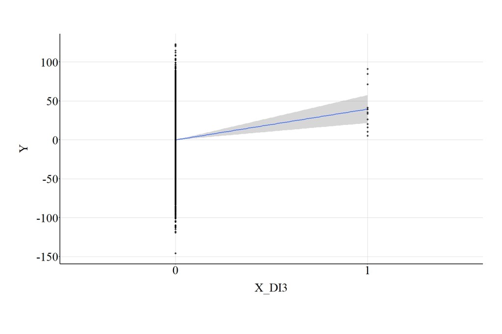
We can also dichotomize the scores on X by splitting the distribution at a more extreme value, such as 30. Splitting the distribution at 30, means that the 12 cases that score higher than 30 received a value of 1 on the third dichotomous version of X and the 9,988 cases that scored below 30 received a value of 0.
## Dichotomous Recode 3 ####
> summary(DF$X)
          Min.        1st Qu.         Median           Mean        3rd Qu.
-39.0733074883  -6.6657355322   0.0074956162   0.1341346317   6.9266877113
          Max.
 39.3637051101
> DF$X_DI3<-NA
> DF$X_DI3[DF$X<=30]<-0
> DF$X_DI3[DF$X>30]<-1
> summary(DF$X_DI3)
   Min. 1st Qu.  Median    Mean 3rd Qu.    Max.
 0.0000  0.0000  0.0000  0.0012  0.0000  1.0000
> table(DF$X_DI3)

   0    1
9988   12
>
Using this dichotomous version of X, we can estimate the association with Y and identify that the association is even further attenuated. In particular, the spearman correlation between the third dichotomous version of X and Y was .04, the t-score was 4.320, and the X2-square score was 18.660. The error in the statistical association between the third dichotomous version of X and Y is evident in Figure 4, where the 95% confidence interval band (gray area) spreads out substantially as we move from 0 to 1 on X.
[Figure 4]
3.4. Ordered Recode 1
Following suit, we can create an ordered measure for the independent variable by splitting the distribution of X at the quartiles and assigning cases a value of 1, 2, 3, or 4. This process is used in the syntax below to create X_OR1.
> summary(DF$X)
          Min.        1st Qu.         Median           Mean        3rd Qu.
-39.0733074883  -6.6657355322   0.0074956162   0.1341346317   6.9266877113
          Max.
 39.3637051101
> DF$X_OR1<-NA
> DF$X_OR1[DF$X>=quantile(DF$X,0) & DF$X < quantile(DF$X,.25)]<-1
> DF$X_OR1[DF$X>=quantile(DF$X,.25) & DF$X < quantile(DF$X,.50)]<-2
> DF$X_OR1[DF$X>=quantile(DF$X,.50) & DF$X < quantile(DF$X,.75)]<-3
> DF$X_OR1[DF$X>=quantile(DF$X,.75) & DF$X <= quantile(DF$X,1)]<-4
> summary(DF$X_OR1)
   Min. 1st Qu.  Median    Mean 3rd Qu.    Max.
   1.00    1.75    2.50    2.50    3.25    4.00
> table(DF$X_OR1)

   1    2    3    4
2500 2500 2500 2500
>
After creating X_OR1, we can regress Y on X_OR1 and estimate the linear association. The spearman correlation between the first ordered version of X and Y was .30, the t-score was 31.630, and the X2-square score was 1000.445. These test-statistics are extremely close to the values produced when estimating the linear association between the continuous version of X and Y. Figure 5 highlights that the linear regression line between the first ordered version of X and Y is almost identical to the linear regression line between the continuous version of X and Y.
[Figure 5]

3.5. Ordered Recode 2
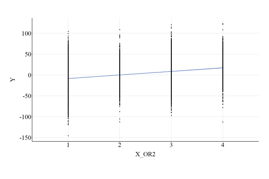
We can also create an ordered measure for X by splitting the distribution at more extreme values. Here we split the distribution into four quartiles providing a value of “1” to cases that scored between the minimum value and the 50th percentile, a value of “2” to cases that score between the 50th percentile and the 60th percentile, a value of “3” to cases that scored between the 60th percentile and the 90th percentile, and a value of “4” to cases that scored between the 90th percentile and the maximum value.
> summary(DF$X)
          Min.        1st Qu.         Median           Mean        3rd Qu.
-39.0733074883  -6.6657355322   0.0074956162   0.1341346317   6.9266877113
          Max.
 39.3637051101
> DF$X_OR2<-NA
> DF$X_OR2[DF$X>=quantile(DF$X,0) & DF$X < quantile(DF$X,.50)]<-1
> DF$X_OR2[DF$X>=quantile(DF$X,.50) & DF$X < quantile(DF$X,.60)]<-2
> DF$X_OR2[DF$X>=quantile(DF$X,.60) & DF$X < quantile(DF$X,.90)]<-3
> DF$X_OR2[DF$X>=quantile(DF$X,.90) & DF$X <= quantile(DF$X,1)]<-4
> summary(DF$X_OR2)
   Min. 1st Qu.  Median    Mean 3rd Qu.    Max.
    1.0     1.0     1.5     2.0     3.0     4.0
> table(DF$X_OR2)

   1    2    3    4
5000 1000 3000 1000
Similar to X_OR1, we can regress Y on X_OR2 and estimate the linear association. The spearman correlation between this ordered version of X and Y was .29, the t-score was 30.709, and the X2-square score was 943.050. Figure 6 highlights that the linear regression line between second ordered version of X and Y is almost identical to the linear regression line between the first ordered version of X and Y, as well as the association between the continuous version of X and Y.
[Figure 6]
3.6. Ordered Recode 3
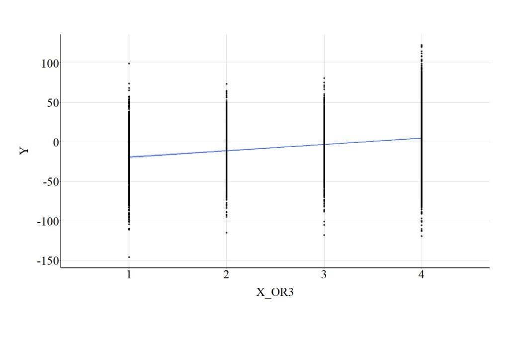
Finally, we can make the split even more extreme! For X_OR3 a value of “1” was assigned to cases that scored between the minimum value and the 10th percentile, a value of “2” was assigned to cases that score between the 10th percentile and the 20th percentile, a value of “3” was assigned to cases that scored between the 20th percentile and the 30th percentile, and a value of “4” was assigned to cases that scored between the 30th percentile and the maximum value.
> summary(DF$X)
          Min.        1st Qu.         Median           Mean        3rd Qu.
-39.0733074883  -6.6657355322   0.0074956162   0.1341346317   6.9266877113
          Max.
 39.3637051101
> DF$X_OR3<-NA
> DF$X_OR3[DF$X>=quantile(DF$X,0) & DF$X < quantile(DF$X,.10)]<-1
> DF$X_OR3[DF$X>=quantile(DF$X,.10) & DF$X < quantile(DF$X,.20)]<-2
> DF$X_OR3[DF$X>=quantile(DF$X,.20) & DF$X < quantile(DF$X,.30)]<-3
> DF$X_OR3[DF$X>=quantile(DF$X,.30) & DF$X <= quantile(DF$X,1)]<-4
> summary(DF$X_OR3)
   Min. 1st Qu.  Median    Mean 3rd Qu.    Max.
    1.0     3.0     4.0     3.4     4.0     4.0
> table(DF$X_OR3)

   1    2    3    4
1000 1000 1000 7000
When the linear association between X_OR3 and Y was estimated, the spearman correlation was .25, the t-score was 26.559, and the X2-square score was 705.404. Figure 7 highlights that the linear regression line between the third ordered version of X and Y is attenuated when compared to the linear regression line between the previous ordered versions of X and Y, as well as the association between the continuous version of X and Y.
[Figure 7]
4. Data Transformations
Below we will speed up our review of the materials as it is extremely similar to the results presented in Entry 13.
4.1. Multiplying By a Constant
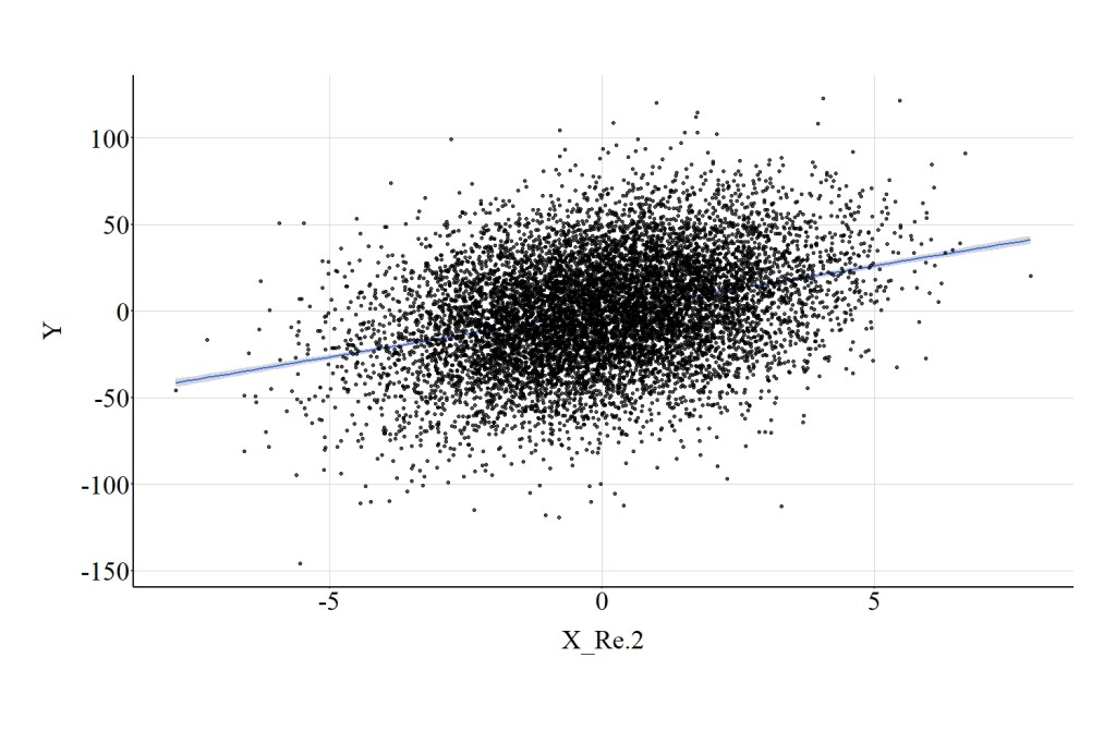
4.1.1. Example 1: X*.2
> DF$X_Re.2<-X*.2
> summary(DF$X_Re.2)
          Min.        1st Qu.         Median           Mean        3rd Qu.
-7.81466149766 -1.33314710645  0.00149912325  0.02682692633  1.38533754226
          Max.
 7.87274102203
>
For this example, we can multiply the cases’ scores on X by .2 – a constant – and shift the distribution of scores on X closer to 0. Visually, the distribution of X and X_Re.2 are identical excluding the magnitude of a unit change on the distribution. Consistent with the identical distributions, the magnitude of the association between X_Re.2 and Y is identical to the association between X and Y, which is demonstrated in both the test statistics and Figure 8. Specifically, the spearman correlation was .31, the t-score was 35.143, and the X2-square score was 1235.034.
[Figure 8]
4.1.2. Example 1: X*20
> DF$X_Re2<-X*20
> summary(DF$X_Re2)
          Min.        1st Qu.         Median           Mean        3rd Qu.
-781.466149766 -133.314710645    0.149912325    2.682692633  138.533754226
          Max.
 787.274102203
>
Similarly, we can multiply X by 20 to observe the effects on the association between X_Re2 and Y. Similar to the first example, the magnitude of the association between X_Re2 and Y is identical to the association between X and Y, which is demonstrated in both the test statistics and Figure 9. Specifically, the spearman correlation was .31, the t-score was 35.143, and the X2-square score was 1235.034.
[Figure 9]

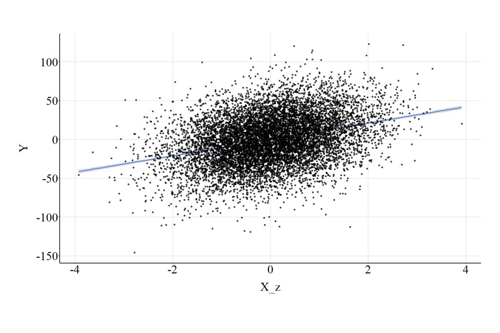
4.2. Standardizing Scores on X
> DF$X_z<-scale(DF$X)
> summary(DF$X_z)
       V1
 Min.   :-3.9194399384
 1st Qu.:-0.6797608121
 Median :-0.0126596888
 Mean   : 0.0000000000
 3rd Qu.: 0.6790293471
 Max.   : 3.9216520381
>
Using the scale function in R, we can standardize the distribution of X to possess a mean of 0 and a standard deviation of 1. Although the scale of X has changed, the magnitude of the association between X_Z and Y is identical to the association between X and Y (Figure 10). In particular, the spearman correlation was .31, the t-score was 35.143, and the X2-square score was 1235.034.
[Figure 10]
4.3. Normalizing Scores on X
> DF$X_n<-((DF$X)-min(DF$X))/((max(DF$X))-min(DF$X))
> summary(DF$X_n)
       Min.     1st Qu.      Median        Mean     3rd Qu.        Max.
0.000000000 0.413166831 0.498244411 0.499858942 0.586457766 1.000000000
>
We can also normalize the distribution of X to ensure that all cases receive a score between 0 and 1. Similar to the standardized distribution, the magnitude of the association between X_n and Y is identical to the association between X and Y (Figure 11). Specifically, the spearman correlation was .31, the t-score was 35.143, and the X2-square score was 1235.034.
[Figure 11]

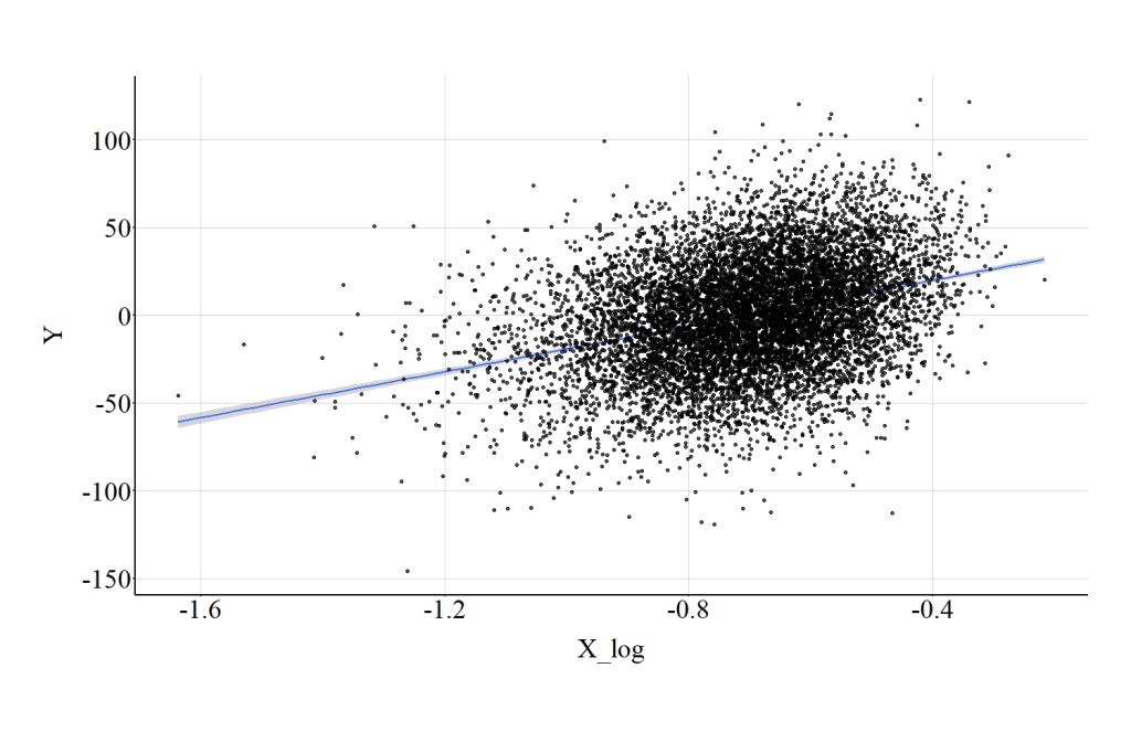
4.4. Log Transformation of X
4.4.1. Base Log
> DF$X_n<-((DF$X)-min(DF$X-25))/((max(DF$X+25))-min(DF$X-25))
>
> DF$X_log<-log(DF$X_n)
> summary(DF$X_log)
        Min.      1st Qu.       Median         Mean      3rd Qu.         Max.
-1.636562785 -0.805262400 -0.695293774 -0.705913906 -0.592758801 -0.216475756
>
After normalizing X, we can implement a base log transformation and examine the effects of X_log on Y. The magnitude of the association between X_log and Y is slightly attenuated when compared to the association between X and Y, but the effects are largely similar (Figure 12). Specifically, the spearman correlation was .31, the t-score was 34.888, and the X2-square score was 1217.141.
[Figure 12]
4.4.2. Log 10
> DF$X_n<-((DF$X)-min(DF$X-25))/((max(DF$X+25))-min(DF$X-25))
>
> DF$X_log10<-log10(DF$X_n)
> summary(DF$X_log10)
         Min.       1st Qu.        Median          Mean       3rd Qu.
-0.7107501868 -0.3497210166 -0.3019622495 -0.3065745140 -0.2574318762
         Max.
-0.0940142264
>
We can also implement a log 10 transformation and examine the effects of X_log10 on Y. The magnitude of the association between X_log10 and Y was identical to the magnitude of the association between X_log and Y (Figure 13). Specifically, the spearman correlation was .31, the t-score was 34.888, and the X2-square score was 1217.141.
[Figure 13]

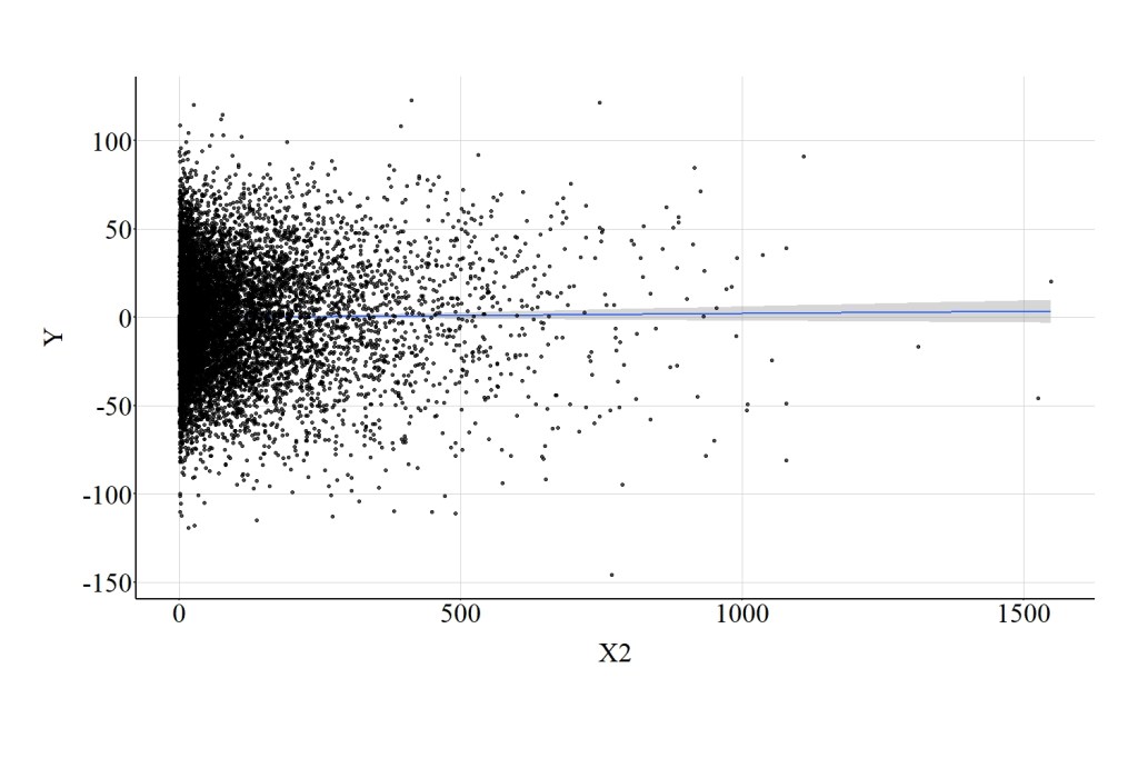
4.5. Power Transformations-Raw Scale
4.5.1. X Squared
> DF$X2<-DF$X^2
> summary(DF$X2)
          Min.        1st Qu.         Median           Mean        3rd Qu.
   0.000000002   10.480235412   46.342638585  100.074550598  132.529852859
          Max.
1549.501279997
>
As demonstrated in the current example (X raised to the 2nd power), subjecting the raw scale of X to a power transformation, however, has undesirable consequences. In particular, the association between X2 and Y is null, which is demonstrated by a spearman correlation of .01, a t-score of 1.044, and a X2-square score of 1.091 and further supported by Figure 14.
[Figure 14]
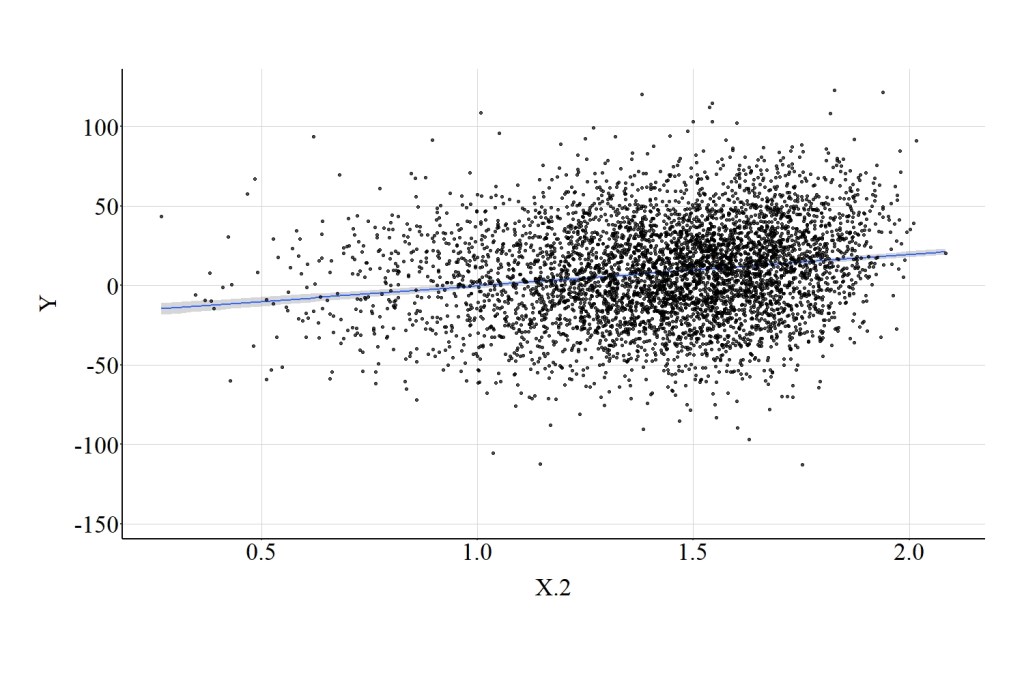
4.5.2. X Raised to the .2 Power
> DF$X.2<-DF$X^.2
> summary(DF$X.2)
      Min.    1st Qu.     Median       Mean    3rd Qu.       Max.       NA's
0.26917726 1.26999736 1.47234769 1.43429322 1.63602339 2.08458301       4997
>
Raising the raw scale of X to the power of .2, does not have as drastic of an impact on the association. Nevertheless, the linear association between X.2 and Y is still attenuated. The spearman correlation was .18, the t-score was 12.838, and the X2-square score was 164.813 (Figure 15).
[Figure 15]
4.6 Power Transformations-Normalized Scale
4.6.1. X Squared
> DF$X_n<-((DF$X)-min(DF$X-25))/((max(DF$X+25))-min(DF$X-25))
>
> DF$X2_n<-DF$X_n^2
> summary(DF$X2_n)
        Min.      1st Qu.       Median         Mean      3rd Qu.         Max.
0.0378878208 0.1997827407 0.2489290038 0.2559793426 0.3055879661 0.6485919396
>
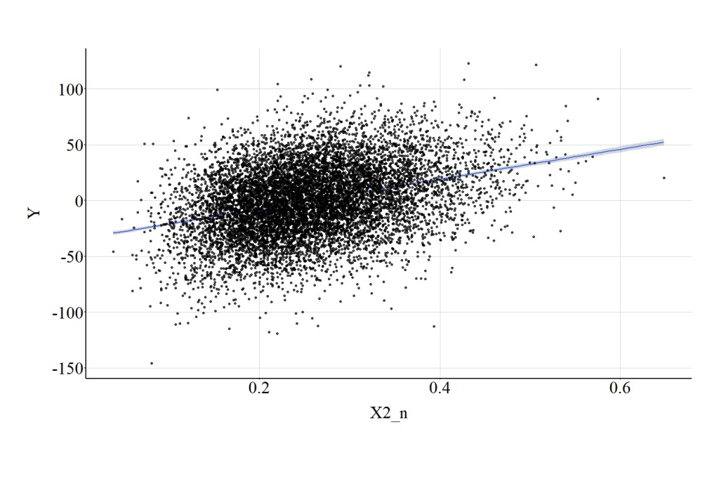
Raising the normalize scores on X to the 2nd power has limited impact on the magnitude of the association between X2_n and Y. Specifically, the spearman correlation was .31, the t-score was 35.143, and the X2-square score was 1235.034. (Figure 16).
[Figure 16]
4.6.2. X Raised to the .2 Power
> DF$X.2_n<-DF$X_n^.2
> summary(DF$X.2_n)
       Min.     1st Qu.      Median        Mean     3rd Qu.        Max.
0.720858398 0.851247397 0.870176900 0.868777189 0.888205841 0.957628703
>
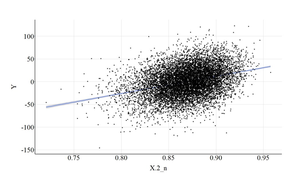
Similarly, raising the normalize scores on X to the .2 power produces results identical to the association between X and Y. Specifically, the spearman correlation was .31, the t-score was 35.143, and the X2-square score was 1235.034. (Figure 17).
[Figure 17]
4.7. Rounding Raw Scores
> DF$X_R<-round(DF$X)
> summary(DF$X_R)
    Min.  1st Qu.   Median     Mean  3rd Qu.     Max.
-39.0000  -7.0000   0.0000   0.1344   7.0000  39.0000
>
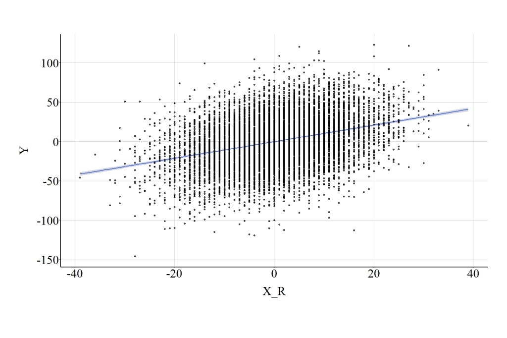
Concerning rounding the distribution of X to the nearest whole number, the statistical tests suggest that the association between X_R and Y is largely identical to the association between X and Y. Specifically, the spearman correlation was .31, the t-score was 35.121, and the X2-square score was 1233.511. (Figure 18).
[Figure 18]
4.8. Excluding Part of the Distribution
> DF$X_C<-DF$X
> DF$X_C[DF$X_C>=5|DF$X_C<=-5]<-NA
> summary(DF$X)
          Min.        1st Qu.         Median           Mean        3rd Qu.
-39.0733074883  -6.6657355322   0.0074956162   0.1341346317   6.9266877113
          Max.
 39.3637051101
> summary(DF$X_C)
       Min.     1st Qu.      Median        Mean     3rd Qu.        Max.
-4.99730075 -2.50686640 -0.12705880 -0.04453803  2.44448142  4.99699775
       NA's
       6197
>
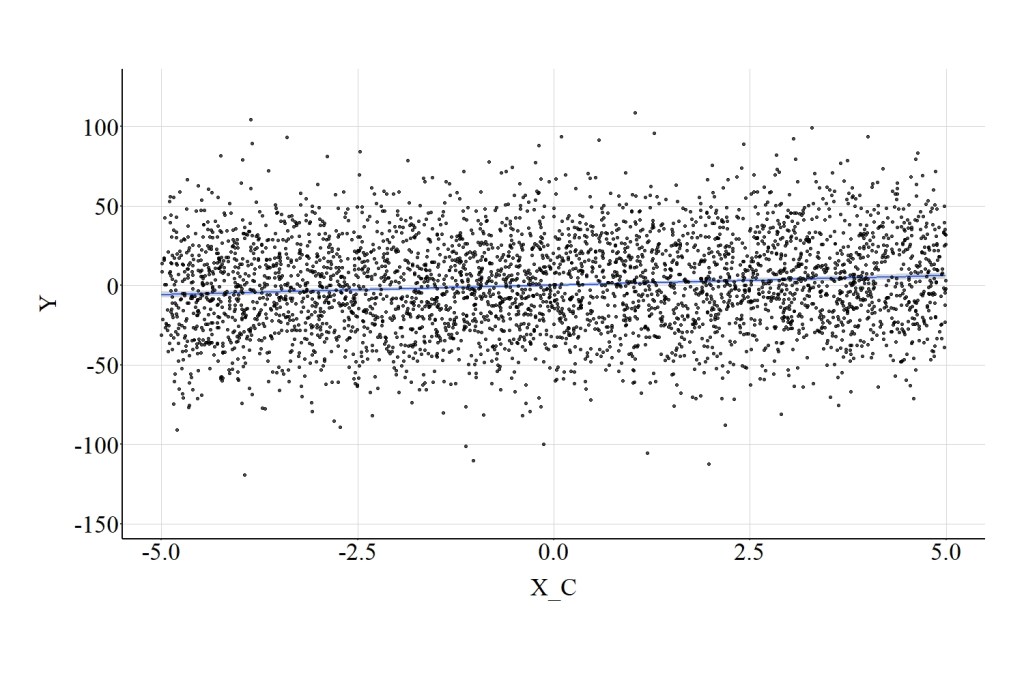
Finally, excluding part of the distribution of X can diminish the magnitude of the association between X_C and Y. That is, the test statistics suggest that X_C has a weaker influence on Y when compared to the association between X and Y. Specifically, the spearman correlation was .11, the t-score was 6.998, and the X2-square score was 48.975. (Figure 19).
[Figure 19]
5. Conclusion
For the sake of clarity, I am going to restate the main conclusion of Entry 13: when possible operationalize all of your measures as continuous constructs without the implementation of a continuous data transformation! I previously, however, forgot to mention that the majority of common data transformations can introduce bias into our statistical models if the variable was not normally distributed prior to the data transformation. While we will address this in a future entry, please know that the results reviewed here do not provide justification for or refute the implementation of strategies used to alter the level of measurement or transform the distribution of continuous constructs. If it is theoretically or empirically relevant to change the level of measurement or implement a continuous data transformation, please do so. Just take some time to recognize the loss of information or potential problems that could occur when implementing these techniques.
License: Creative Commons Attribution 4.0 International (CC By 4.0)

One thought on “Entry 14: Level of Measurement of the Independent Variable”